Colormaps
This is a note about the use of colour in visualisation of data and its limitations.
Definitions
Colormaps: a selection of standard gradients that encode couler that researchers can use to display and evaluate their data. Visualisation software has such colormaps built in.
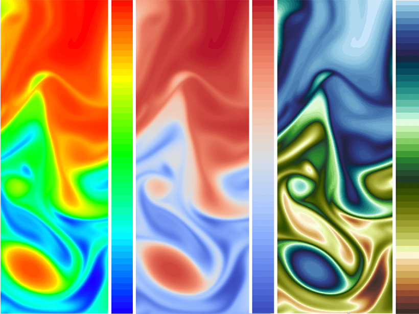
Standard ones, such as the rainbow colormap can be problematic.
“Perceptually equalized colormaps”—maps made with uniformly spaced values in absolute colour space. However, these maps, same as the rainbow colormap, were created independently of the data they are used to represent.
Visualizing Science: How Color Determines What We See - Eos
Examples of Data-Independent Maps
The Viridis palette for R – Thinking on Data
Turbo, An Improved Rainbow Colormap for Visualization
Issues
- Need to consider each data set’s unique properties and needs.
- Need to account for and represent differences in perception/sensing between human cognitive capabilities and the capabilities of other agents: nonhuman living beings or machines, etc.
Colour Blindness
Colour blindness is a human case that illustrates variability of perceptions. Colblindor – All about Color Blindness
Resources
Projects using colour maps Publications (sciviscolor.org).
Colour-based biases effect all humans. Interpreting colour map visualisations requires determining how dimensions of colour in visualisations map onto quantities in data.
Sibrel, Shannon C., Ragini Rathore, Laurent Lessard, and Karen B. Schloss. ‘The Relation Between Color and Spatial Structure for Interpreting Colormap Data Visualizations’. Journal of Vision 20, no. 12 (2020): 7: 1-20. https://doi.org/10/gtd52g.
Animations work better than static views.
Ware, Colin, Daniel Bolan, Ricky Miller, David H. Rogers, and James P. Ahrens. ‘Animated Versus Static Views of Steady Flow Patterns’. In Proceedings of the ACM Symposium on Applied Perception, 77–84. California: ACM, 2016. https://doi.org/10/gtd52f.
Pallet Types
-
Sequential: change in lightness and often saturation of colour incrementally, often using a single hue; should be used for representing information that has ordering.
-
Diverging: change in lightness and possibly saturation of two different colours that meet in the middle at an unsaturated colour; should be used when the information being plotted has a critical middle value, such as topography or when the data deviates around zero.
-
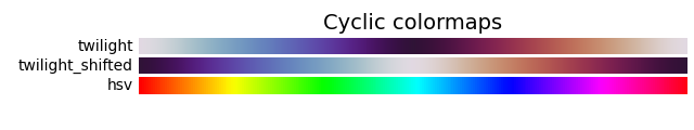
Cyclic: change in lightness of two different colours that meet in the middle and beginning/end at an unsaturated colour; should be used for values that wrap around at the endpoints, such as phase angle, wind direction, or time of day.
-
Qualitative: often are miscellaneous colours; should be used to represent information which does not have ordering or relationships.
-
Miscellaneous: miscellaneous colormaps have particular uses for which they have been created. For example, gist_earth, ocean, and terrain all seem to be created for plotting topography (green/brown) and water depths (blue) together.
Packages
Perceptually uniform packages (we used these maps in Kummargi Gadhaba Yulendj Tarrang project (2023)).

ColorBrewer
ColorBrewer, based on the work from Cynthia Brewer. It has been updated to have maps safe for colour blindness and printing in black and white. The pallets in the package are 'sequential', 'divergent' and 'qualitative'.
Harrower, Mark, and Cynthia A. Brewer. ‘ColorBrewer.Org: An Online Tool for Selecting Colour Schemes for Maps’. The Cartographic Journal 40, no. 1 (2003): 27–37. https://doi.org/10/ch4c57.
Olson, Judy M., and Cynthia A. Brewer. ‘An Evaluation of Color Selections to Accommodate Map Users with Color-Vision Impairments’. Annals of the Association of American Geographers 87, no. 1 (1997): 103–34. https://doi.org/10/fjmq6k.
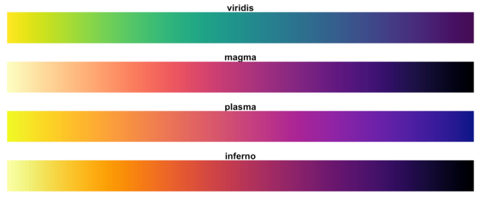
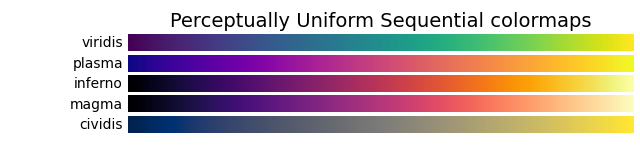
Viridis
Viridis, includes color maps viridis, magma, inferno, and plasma. Presentation of viridis at SciPy 2015.
Cividis is a further enhancement of viridis where it enables nearly-identical visual-data interpretation. It is perceptually uniform in hue and brightness, and increases in brightness linearly.
Olson, Judy M., and Cynthia A. Brewer. ‘An Evaluation of Color Selections to Accommodate Map Users with Color-Vision Impairments’. Annals of the Association of American Geographers 87, no. 1 (1997): 103–34. https://doi.org/10/fjmq6k.
Seaborn
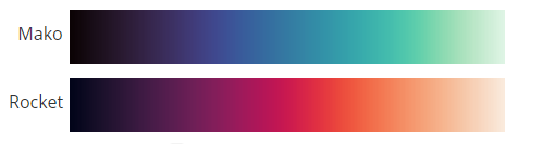
Seaborn, includes colour maps 'mako' and 'rocket' which were originally created for the Seaborn statistical data visualization package for Python.
Waskom, Michael. ‘Seaborn: Statistical Data Visualization’. Journal of Open Source Software 6, no. 60 (2021): 3021. https://doi.org/10/gjqn3g.
matplotlib
matplotlib, includes non-perceptually-uniform maps organised into 'sequentials, 'divergent', 'cyclic', 'qualitativeq and 'miscellaneous'. The perceptually uniform colour maps include 'viridis' and a cyclical map called Twilight. 'hsv' is not perceptually uniform and was not used.
Hunter, John D. ‘Matplotlib: A 2D Graphics Environment’. Computing in Science & Engineering 9, no. 3 (2007): 90–95. https://doi.org/10/drbjhg.
Coding with Colormaps
R-Studio:
Python:
Precedent
An example of how to report such work in application:
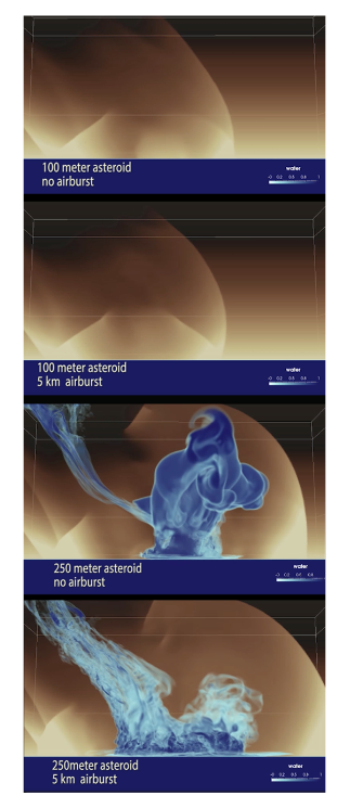
Samsel, Francesca, John M. Patchett, David Honegger Rogers, and Karen Tsai. ‘Employing Color Theory to Visualize Volume-Rendered Multivariate Ensembles of Asteroid Impact Simulations’. In Proceedings of the 2017 CHI Conference Extended Abstracts on Human Factors in Computing Systems, 1126–34. CHI EA ’17. New York: Association for Computing Machinery, 2017. https://doi.org/10/gtd8bt.
References
Nuñez, Jamie R., Christopher R. Anderton, and Ryan S. Renslow. ‘Optimizing Colormaps with Consideration for Color Vision Deficiency to Enable Accurate Interpretation of Scientific Data’. Edited by Jesús Malo. PLOS ONE 13, no. 7 (2018): e0199239. https://doi.org/10/gdzkg4.